How to Turn Your Handwriting Into a Font (Free + Easy Method)
Your handwriting is unmistakably you. Here's the simplest way to turn it into a real, installable font you can type with anywhere.
Your handwriting is the closest thing you have to a signature on paper. It's the slant of your g, the way you cross your t, the loop that's a little too generous on your y. So when designers, teachers, and journalers want to add a personal touch to their work, the question is almost always the same: how do I turn my handwriting into an actual font I can type with?
Good news: it's faster than it used to be. You don't need a Wacom tablet, a $500 license, or any font software on your computer. You can do it in a browser, in about 10 minutes, with a sheet of paper and your phone camera. Here's exactly how — and the small mistakes that ruin most first attempts.
Quick version: write your alphabet on paper, take a clean photo, upload it to a font tool like Typegrove, assign each letter, and export the .otf. Read on for the version that doesn't suck.
What you'll need
- A piece of plain white paper (graph or lined paper works too — you'll crop it out)
- A black or dark pen — felt-tip and fine liners give the cleanest results
- Your phone camera, or a scanner if you have one
- A free browser-based tool like Typegrove (no install needed)
Step 1: Write out your alphabet (the right way)
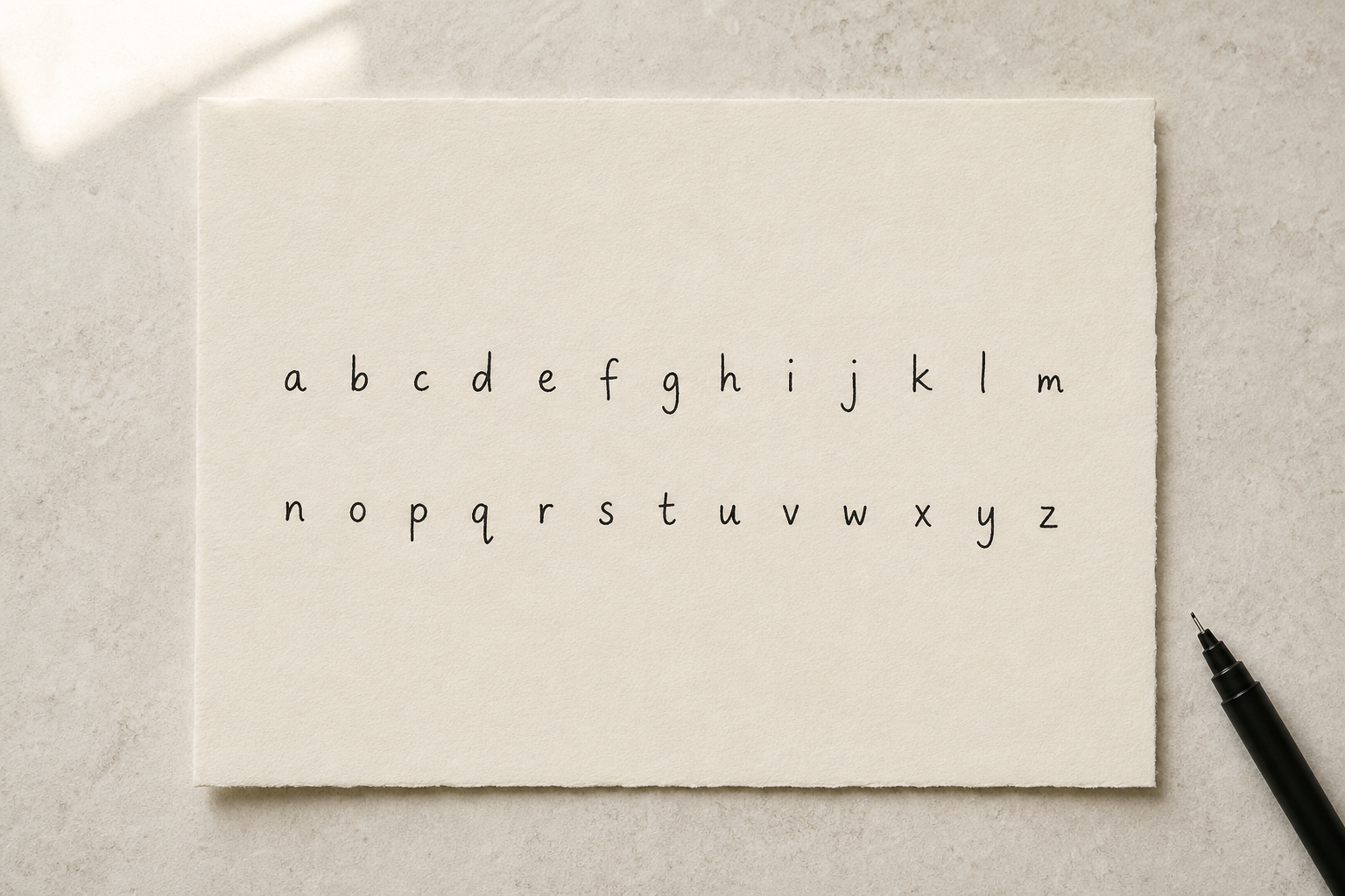
This is the step most people rush, and it's where 90% of bad handwriting fonts come from. You're going to write each letter at least once, and write each one the way you actually write it in real life — not the way you'd write it for a teacher.
What to write:
- Uppercase A–Z
- Lowercase a–z
- Numbers 0–9
- Common punctuation: . , ! ? ' " - : ;
Write each letter with consistent spacing — somewhere between 1 and 2 cm between glyphs is plenty. Don't crowd them. The font tool needs to see white space around each character to detect it cleanly.
Step 2: Photograph it (or scan it)
Lay the paper flat. Use natural daylight if possible — overhead light casts shadows and makes the background uneven. Take the photo straight on, not at an angle. If you have a scanner, even better: 300 DPI in black-and-white mode is perfect.
What you're aiming for:
- The whole sheet in frame, no shadows
- High contrast between ink and paper
- Letters fully crisp, not blurry
Step 3: Upload and let the tool do the work
This is where things have changed dramatically in the last few years. Older font software made you draw each glyph individually inside their editor — hours of work. Modern web tools handle the boring parts for you: they detect each character, trace the outline into vector paths, and line them up on a baseline.
With Typegrove specifically, you upload your photo or scan, and it vectorizes everything in your browser — no server upload of your artwork, no waiting. From there you assign each shape to a character ("this curl is my g"), and you're basically done.
Step 4: Assign characters and tweak spacing
Once your glyphs are detected, go through them one at a time and assign each to its character. This takes 5–10 minutes for a full alphabet. Pay attention to spacing here — letters that look too close together on the page often need a little extra room in a font, because they'll appear in infinite combinations of words.
If your tool has a live preview pane (Typegrove does, and so does Calligraphr), type out a sentence like "The quick brown fox" and look at it critically. Are the letters bumping into each other? Are some way taller than others? That's all fixable.
Step 5: Export your .otf and install it
Hit export, choose .otf (which works almost everywhere), and download. Double-click the file to install it on macOS or Windows. Now it'll show up in Word, Figma, Photoshop, Canva, your code editor — anywhere fonts live.
Common mistakes (and how to avoid them)
Mistake 1: Inconsistent letter sizing
If your o is twice the height of your e, your font will look broken in real sentences. Try to write all your lowercase letters the same x-height, and all your uppercase letters to the same cap height. A faint pencil baseline helps.
Mistake 2: Spacing that's too tight
When you write naturally on lined paper, your letters often touch or nearly touch. In a font, that becomes unreadable. Give yourself a consistent gap — when in doubt, more space, not less.
Mistake 3: Photographing in bad light
A shadow across half your page will make half your letters disappear in vectorization. Move to a window. Or scan it.
Mistake 4: Skipping punctuation
It's tempting to ship just A–Z. Don't. A font without commas and periods feels half-done the first time you try to type a real sentence with it.
Before and after: what good looks like
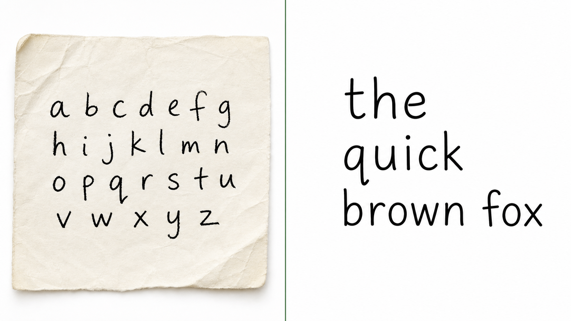
Notice how the spacing got tightened up automatically, and the strokes got smoothed without losing the personality? That's vectorization working in your favor — it keeps the human feel and ditches the paper texture.
Where to go from here
Once you've got your handwriting font, you've basically unlocked a superpower. A few things to try:
- Use it on your portfolio site or résumé for personality without going overboard
- Add it to client deliverables when they want something "more human"
- If you also draw, try making a font from your drawings — same process, way more chaotic shapes
- If your handwriting lives in old notebooks as photos, learn how to make a font from an image
And if you're trying to figure out which tool is best for your specific workflow, our roundup of the best AI font generators and the head-to-head Fontself vs Calligraphr vs Typegrove comparison will save you an afternoon of trial-and-error.
Frequently asked questions
Can I really make a handwriting font for free?+
Yes. Tools like Typegrove and Calligraphr both have free tiers that let you upload your handwriting, generate a font, and download an installable .otf without paying. Paid plans usually unlock extras like higher glyph counts, multi-color fonts, or commercial licensing.
How long does it take to make a handwriting font?+
If your alphabet sheet is clean, you can go from photo to installed font in about 10–15 minutes. The bottleneck is usually writing the alphabet legibly — not the software.
Do I need a tablet or stylus?+
No. Pen and paper plus a phone camera works perfectly. A tablet (iPad with Apple Pencil, for example) just makes it easier to redo letters you don't like without re-photographing the whole sheet.
Will my handwriting font work in Word, Figma, and Canva?+
Yes — once you install the .otf on your computer, it shows up in any app that lets you pick a font. Canva and Figma also let you upload custom fonts to use in the browser.
Can I sell products with my handwriting font?+
Usually yes, but check your tool's license. Most font generators give you full commercial rights to fonts you create from your own handwriting on paid plans, and personal use on free plans.
Ready when you are
Turn your work into a font in minutes.
Drag in your drawings, handwriting, or images. Get an installable .otf ready for any app — Figma, Photoshop, Word, your website.
Try Typegrove freeNo credit card. No download. Works in your browser.
Keep reading
More guides on turning what you make into fonts.
How to Create a Font From Your Drawings (Step-by-Step Guide)
From sketchbook scribbles to a working typeface — here's exactly how illustrators and iPad artists turn drawings into fonts.
Read articleTutorialHow to Make a Font From an Image (Beginner-Friendly Tutorial)
Already have artwork? You don't need to start from scratch. Here's how to convert an image into a font that actually looks good.
Read articleComparisonBest AI Font Generators (And Which Ones Are Actually Worth It)
We tried the most popular AI font generators so you don't have to. Here's which ones are genuinely useful — and which to skip.
Read articleComparisonFontself vs Calligraphr vs Typegrove: Which Is Better?
Three of the most-searched font creation tools, side by side. Here's how Fontself, Calligraphr, and Typegrove actually stack up.
Read article