How to Create a Font From Your Drawings (Step-by-Step Guide)
From sketchbook scribbles to a working typeface — here's exactly how illustrators and iPad artists turn drawings into fonts.
If you draw — on paper, on iPad, in a sketchbook at 1am — you've probably had this thought: I wish I could type with these. The weird little characters in your sketchbook margins. The branding glyphs you doodled for a friend's bakery. The custom letterforms you scribbled out and never used. They all want to be a font, and now they can be.
This guide walks through the actual workflow used by illustrators, letterers, and brand designers to turn drawings into a working typeface — both the paper-and-camera version and the all-iPad version. By the end you'll have a usable .otf you can install and ship in real projects.
New to the idea? Start with the easier sibling guide: how to turn handwriting into a font. Then come back here when you're ready for the more illustrative version.
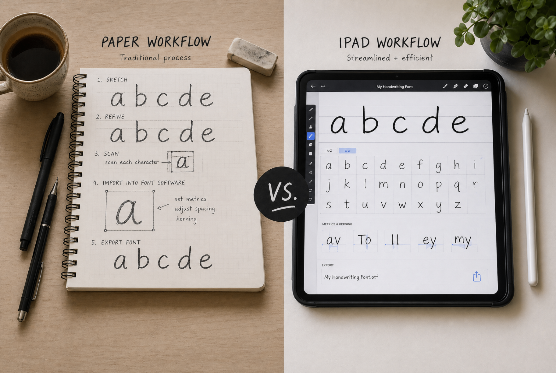
The two workflows: paper or iPad
Both work. Pick the one that matches how you already draw.
Paper workflow (pen → camera → font)
- Draw your letters/glyphs on white paper with a black pen
- Photograph or scan the page in good light
- Upload the image to a font tool that auto-vectorizes
- Assign each shape to a character
- Export and install
iPad workflow (Procreate → SVG → font)
- Draw each letter on a white background in Procreate, Affinity, or similar
- Export each glyph as a PNG (or SVG if your tool supports it)
- Drag them into a font tool
- Assign characters and adjust spacing
- Export your .otf
The iPad workflow is faster to iterate on (undo any letter without redoing the whole sheet), but paper has its own charm — pen pressure, ink bleed, the imperfections that make a font feel alive.
Tips for clean glyphs that vectorize well
Use solid fills, not loose strokes
Auto-vectorization works best when each letter is a single solid shape. Wispy pencil strokes or unfilled outlines confuse the tracer. If you're on iPad, fill your shapes. If you're on paper, use a real pen, not a pencil.
Keep contrast high
Black ink on white paper, or pure black on a white canvas. Anything muddy in the middle (gray, sepia, light blue) needs more careful threshold settings, and most beginners give up before getting it right.
Stay consistent in weight
If your A is bold and your B is hairline, the font will look chaotic in a real sentence. Pick a weight and stick with it across the whole alphabet. You can always make a "Bold" version later.
Mind your baseline
Letters need to sit on a consistent baseline for the font to look right. If you're drawing freely, draw a faint horizontal line and use it as a guide. Tools will let you nudge each glyph up or down later, but it's easier to get it right at the source.
Step-by-step: from sketch to usable font
Step 1: Decide your scope
Are you making a full alphabet, or a small set of branding glyphs (e.g. a custom monogram, a few icons, a logotype)? Both are valid. Branding glyphs need fewer characters but way more attention per glyph.
Step 2: Draw with consistency in mind
Even if your style is wild, one thing should be consistent: the rhythm. The space between strokes, the cap height, the thickness of the heaviest line. The personality lives in the shapes, but readability lives in the rhythm.
Step 3: Get your files into a font tool
Drag your PNGs, JPGs, or SVGs into Typegrove. SVGs from Procreate or Illustrator will keep their crisp paths. PNGs and JPGs get auto-traced — quality depends on the source resolution. Anything below 1024px on the long edge is going to look soft, so export big.
Step 4: Assign characters
This is the surprisingly satisfying part. Click each detected glyph, type the character it represents, and watch your sentence preview start to read like real type instead of disconnected shapes.
Step 5: Adjust spacing and metrics
Most tools give you sliders for letter spacing (tracking) and individual glyph offsets. If your sentences look too tight, loosen the global spacing first. If one specific letter is leaning into its neighbor, adjust just that glyph.
Step 6: Export your .otf
Download the .otf. Install. Open Figma. Type your name. Cry a little. That's the workflow.
Creative use cases for a custom drawn font
Once you have a font that's truly yours, you start finding excuses to use it. A few that come up often:
- Brand identities. A logotype is fine; a full custom font lets the brand voice extend into product, packaging, social posts, even error messages.
- Merch and print. T-shirts, tote bags, zines, posters — your font becomes a recognizable signature across formats without you having to redraw text every time.
- Editorial illustration. Magazine spreads with custom headlines that match the illustrator's style instead of fighting it.
- Indie game UI. Drawn fonts give small games an identity that no off-the-shelf typeface can match.
- Social content. If you post art regularly, captioning in your own font is an instant style upgrade.
What if I only have old artwork as photos?
That's a different (slightly easier) problem — see our guide to making a font from an image. The principles are the same, but you skip the drawing step and focus on getting clean shapes out of existing scans.
Picking the right tool for the job
There are a handful of font generators worth considering — some do exactly one thing well, some are bloated. We did the legwork in our roundup of the best AI font generators and a focused Fontself vs Calligraphr vs Typegrove comparison. If you draw on iPad and want the lowest-friction path, start with Typegrove — it accepts both raster and SVG, and runs entirely in your browser.
Frequently asked questions
Can I make a font from drawings I did in Procreate?+
Yes. Export each glyph as a PNG with a transparent or white background, then drag them into a font tool. SVG export (via Procreate's native PDF export or Affinity Designer) will give you even crisper results.
How many glyphs do I need to draw for a usable font?+
For a usable English font: 26 lowercase, 26 uppercase, 10 digits, and ~10 punctuation marks. About 70 glyphs. For a logo or display font, you might only need 5–15 specific characters.
What's the difference between making a font from a drawing vs from handwriting?+
The process is nearly identical — both are upload-and-assign. The difference is creative: drawings tend to be more illustrative and stylized, handwriting tends to be more uniform. Drawing fonts often need more spacing tweaks.
Can I use my drawn font commercially?+
Yes, fonts you create from your own drawings are yours. Just check the export tool's license — most paid plans grant full commercial rights, and free plans usually allow personal projects.
Do I need to know typography to make a good drawn font?+
Helpful but not required. The basics — consistent baseline, similar x-heights, even spacing — get you 80% of the way. Tools like Typegrove handle the technical font metrics automatically so you can focus on the drawings.
Ready when you are
Turn your work into a font in minutes.
Drag in your drawings, handwriting, or images. Get an installable .otf ready for any app — Figma, Photoshop, Word, your website.
Try Typegrove freeNo credit card. No download. Works in your browser.
Keep reading
More guides on turning what you make into fonts.
How to Turn Your Handwriting Into a Font (Free + Easy Method)
Your handwriting is unmistakably you. Here's the simplest way to turn it into a real, installable font you can type with anywhere.
Read articleTutorialHow to Make a Font From an Image (Beginner-Friendly Tutorial)
Already have artwork? You don't need to start from scratch. Here's how to convert an image into a font that actually looks good.
Read articleComparisonBest AI Font Generators (And Which Ones Are Actually Worth It)
We tried the most popular AI font generators so you don't have to. Here's which ones are genuinely useful — and which to skip.
Read articleComparisonFontself vs Calligraphr vs Typegrove: Which Is Better?
Three of the most-searched font creation tools, side by side. Here's how Fontself, Calligraphr, and Typegrove actually stack up.
Read article